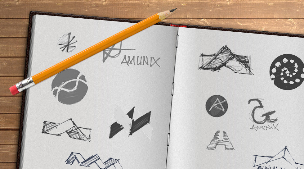
A logo design represents the purpose and meaning of a brand or company without providing a complete visual representation. That Every company strives to create a good logo that will stick with the public for years to come. That means using a favorite font or merely abbreviating your company name with plain lettering may not help you stand out from your competitors.
A good logo is distinctive, appropriate, practical, graphic, and simple in form, and it conveys the owner’s intended message. A concept or “meaning” is usually behind an effective logo, and it communicates the intended message. A logo should be able to be printed at any size and, in most cases, be effective without color. A great logo essentially boils down to two things: great concept and great execution.
Logo Design Process
“Some wonder what’s so difficult about creating a good logo. They’re small, they look easy to do, so no problem, right? When you only see the result of a designer’s efforts, the logo creation can look like it was a simple task. But it’s not. A logo takes thought and creativity, and many elements combine to make a good one.”
When creating a logo, follow a process that ensures the final design meets the needs of the clients. Below, we have listed the typical process that professional logo designers follow. With practice, you will no doubt develop your own.
Logo Design Process
- Design brief.
- Research.
- Reference.
- Sketching and conceptualizing.
- Reflection. Revisions and positioning.
- Delivery and support.
Here are some quick tips to help you learn what makes a good logo design that will stand the test of time.
1 – Keep It Simple
Social media companies like Facebook have straightforward logo designs. They are easily recognizable, and this makes an important point about branding. A simple logo design does not detract the attention away from the brand. Instead, it merely signals and supports it. Having an overly crowded or busy design may lead to consumers failing to recognize what your brand is about. Your logo should relate to your brand identity, making it a reasonably obvious match to your company name or the services you provide. However, this should be done in the simplest way possible.
2 – Make It Appropriate for Your Company’s Brand
Many family-friendly companies use circles or ovals, which can create a sense of community, friendship, and unity. Triangles, squares, and rectangles often imply masculinity, power, or strength and can be found in many science and technology logo designs. Rings can be found in many pieces of jewelry or wedding-related brand logos as they symbolize marriage and love. Being aware of this when branding can help you immensely. Logos must reflect a company’s brand identity, and many of the most successful businesses from around the world have nailed the art of this concept.
3 – The Power of Colour
Companies who want to tie their brand to nature, growth, or safety may choose a green color scheme. Blue is often found in logos that represent cleanliness, health, or healing. Yellow can be associated with joy and cheerfulness, and it is commonly found in food and toy logos.
A well-thought-out color scheme can create a similar consumer response to using shapes. Not only will it make your logo pop, but if used correctly, the right color or colors can evoke an emotional response or connection with your target audience. Many brands use this method to appeal to their target audience subconsciously. It is something to consider when creating your new or improved logo design.
4 – Timelessness is Key
If your brand has staying power, it is essential to spend time creating a good logo that can be used across decades or even generations.
Coca-Cola and Disney have used the same logo or slight alterations of their original logo since their beginnings. Rather than using a commonly found font, they both created their own for a one-of-a-kind look. When you create a logo design with hand-drawn details, it is incredibly difficult for other companies to replicate your image. This allows your logo design to stand out in a crowd of generic fonts and layouts. Even when used for other purposes, the use of Disney and Coca-Cola fonts immediately connects the public to their original brand.
In contrast, if you look at the logo history of a company such as Pepsi, you will see numerous logo changes to help create a more modern or hip vibe.
Catering to current logo design trends and styles means your logo will endure changes every ten years or less, which is not beneficial for creating a timeless representation of your company.
5 – Versatility is Important
Ensuring your logo is easily adjustable to various sizes is extremely important, especially online where it can be used for a range of uses and formats on social media. Make sure your logo is designed in vector format, making it easily scalable and editable. This creates much more freedom for your graphic design team when imposing your logo on different websites or merchandise.
A distorted logo is not a good look for a professional business, so be sure to spend the time and funds needed for hiring a professional logo designer. In return, you will receive a desirable and functional logo that you can trust to represent your company in every way.
6 – Hire a Professional Designer
Start-up costs for a new brand or company can be incredibly high, so it is common for businesses to look for what can be cut to save some money.
Perhaps someone has a nephew or distant friend who has a knack for graphic design and could probably produce an awesome logo for super cheap. Alternatively, the owner thought it was an easy enough task and started to design a logo themselves. These examples can lead to time being wasted and significant headaches. Cheap logo design services save you no more than a hundred bucks but actually cost you more in a long term.
Unless someone has received the necessary training or attended a graphic design program, chances are their skills in logo design are not up to par.
Always be wary of posting logo design jobs on one-time project sites as it could turn into a lengthy process to find a graphic designer who has the training and capabilities to deliver you a high-quality logo.
7 – Avoid Using Stock Art
Using stock art will make your logo look generic and cheap. It gives the impression to your potential customer or client that no creativity or time was spent designing the logo. They then may believe that the same lackluster attitude is carried into how your business operates. Using stock art can also lead to legal and copyright issues if the art was not provided for use as a logo.
8 – Back to the Basics
As stated previously, color can add a lot of extra elements to your logo design. It can evoke feelings and emotions while providing an eye-appealing visual design. However, it is essential to start your design with the basics: black and white.
Although many companies and brands want a logo that stands out from its competitors by being colorful and highly visible, at some point the logo will not be presented in monotone. So if you are using different colors to contrast or distinguish elements in your logo, once it is printed in black and white, it may be unrecognizable.
Always start your logo design process in black and white and play with the color until you can create a logo that is readily identifiable in any color scheme.
9 – Fonts: Be Highly Selective
When starting the creative process behind logo design, it may seem cutting-edge to use a menagerie of different fonts. However, the overuse of different styles of fonts makes the logo look unprofessional and messy. It creates an almost unreadable logo that may turn customers away instead of coming across as trendy.
Final Words
To answer the question: What makes a good logo design we have covered a range of tips, but it comes down to communication.
The goal of creating a good logo design for your company is to trigger an emotional connection to your actual product or service to your intended audience. You want your logo to define your company quickly but do so originally and creatively, setting you apart from competitors.
The best companies recognize what groups they are trying to attract, whether kids or adults, males or females, and create an appealing, representative design to cater to that audience. Spending time and money on acquiring a professional graphic designer with creativity and sufficient logo design knowledge will save you time, worry, and money in the long run. Be involved in the creative design process to ensure you get a logo you love, and that will best represent your brand or company while being entirely original.
If you want to hire a web designer or if you wish to discuss how we can develop your brand or provide graphic design for your product or business, email us: [email protected]


